Introduction
Although popular for its statistical computing and analysis, R also comes with an impressive set of packages and functions for creating simple and complex visualizations. While working with R, you won’t need any other tool or platform to create graphs or charts.
In this tutorial, we will show you how to create a grouped bar chart using R’s ggplot and dplyr packages.
The Setup
This tutorial was carried out in
- R, version 4.3.1
- RStudio, version 2023.06.1+524
- dplyr, version 1.1.2, and
- ggplot, version 3.4.2
Resources
To help you along on your computer, you can find:
- The dataset for this tutorial in this drive.
- The entire code in this drive.
- And a video tutorial here on YouTube.
Step 1: Load the dataset into R
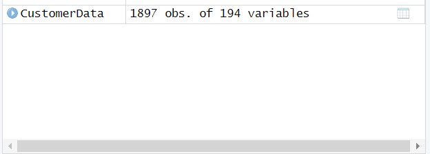
To load the dataset into R, read the .csv file using the read.csv function from the utils package. We assigned an object named ‘CustomerAData’ to the file.
CustomerAData <- utils::read.csv(file = “CustomerAsData.csv”) |
When the data is read in, at the top right corner of the Global environment of R Studio, we can view basic information about the dataset. Our output shows it has 1897 observations and 194 variables.
Step 2: Load dplyr and ggplot2
For our analysis and visualization, we will need the dplyr and ggplot2 packages. We load them at this stage using the library function.
library(dplyr) |
Step 3: Group the data by the columns of interest
We have our packages and dataset loaded. Now we move on to grouping the data we need.
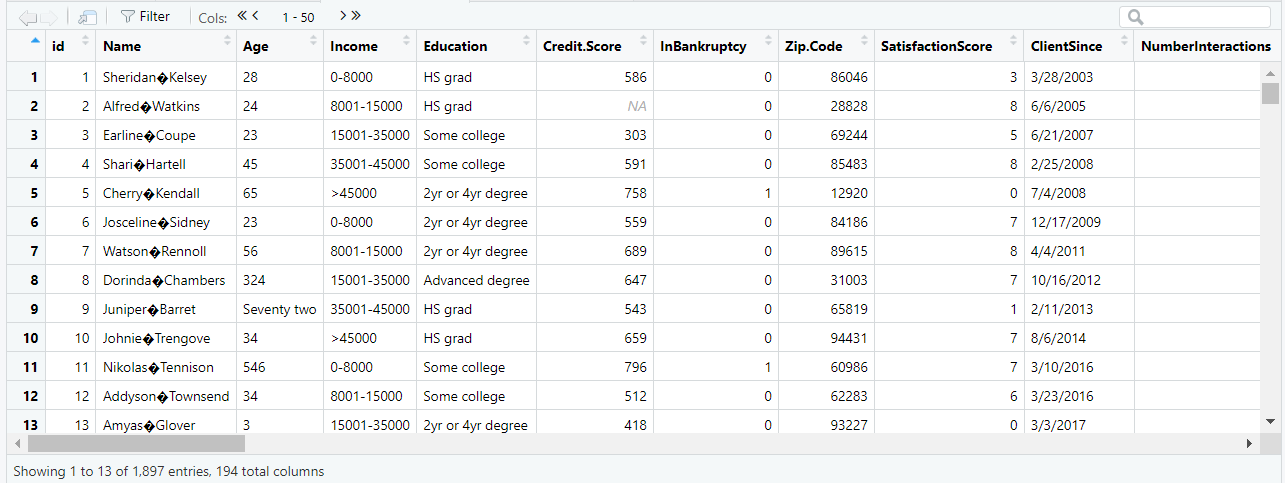
A short view of the dataset
The image above is a preview of the values in the dataset. Our columns of interest are Income and Education. We will group the data by the columns Income and Education using the group_by function in the dplyr package and assign it a new object called ‘aggregateByEducationAndIncome’.
#group the data by the variable(s) of interest |
Step 4: Create summary statistics of the grouped data
To obtain summary statistics for the grouped data, we need to summarize the data using the dplyr package’s summarize function. The function’s parameters will be the aggregated object ‘aggregateByEducationAndIncome’ and a new variable called ‘NumberOfCustomers’ that will reflect the number of customers within each group defined by Income and Education.
#create summary statistics for each level of the variable(s) of interest |
Output
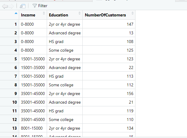
When we look at the table, there’s one row for each combination of Income and Education and there’s a new column called NumberOfCustomers. For example, the first record in the table indicates that there were 147 customers within an income of 0-8,000 and an Education level of 2 yr or 4 yr degree.
Step 5: Sorting with mutate function
We know that Income and Education have a certain sequence to their values, and we must ensure that these are respected so that results are displayed in a consistent order. To achieve this, we will utilize the dplyr package’s mutate function and within its parameters pass the same object from the previous step. The mutate function will include an argument – factor – where we will add new variables called ‘Education’ and ‘Income’ (which will override the variables ‘Education’ and ‘Income’) and specify the levels of Education and Income in the order we want.
#change Income to a factor with a specific order aggregateByEducationAndIncome <- dplyr::mutate(aggregateByEducationAndIncome, Education = base::factor(Education, levels = c(“HS grad”,”Some college”,”2yr or 4yr degree”,”Advanced degree”)), Income = base::factor(Income, levels = c(“0-8000″,”8001-15000″,”15001-35000″,”35001-45000″,”>45000″))) |
Step 6: Visualization
At this stage, we are done with manipulating and sorting. The next few steps will focus on the actual visualization. For this, we will use the ggplot2 package.
Our grouped bar chart will need a few things.
- x and y axis
- Grouped bar figure
- Labels on the bars
- x and y axis labels
Step 6.1: Set the foundation of the chart
To start, we will need the ggplot function from the ggplot2 package. This function sets the base for our chart. It takes a few arguments (other functions) in its parameters – one of which is data. The data function loads the data frame to be used in the visualization. In this case, it is our aggregated object which has all the summary information.
The next argument is the aes function. This function is useful when we need to map the variables in the dataframe to any of the axes. Here, we will map ‘Education’ to the x-axis and NumberOfCustomers to the y-axis.
Next, we have the fill argument which denotes the differentiator for the columns within each level of the x-axis. We set this fill equal to ‘Income’.
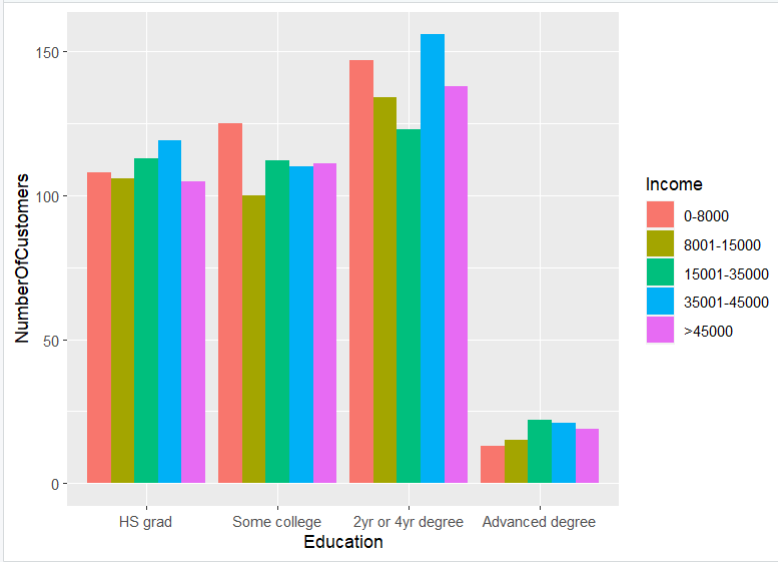
EducationAndIncomeGroupedBarChart <- ggplot2::ggplot(data = aggregateByEducationAndIncome, aes(x = Education, y = NumberOfCustomers, fill = Income)) |
Output
Step 6.2: Create the grouped bars on the chart
The ggplot function lays the foundation for the chart but shows no actual figure or bar. To add bars to the chart, we need the geom_bar function. We will connect this function to the ggplot function with a plus sign.
The geom_bar function takes different arguments as well. One is the position which is equal to ‘dodge’. Dodge tells R that the bars need to be placed side by side as opposed to being stacked. The next argument is the stat argument which is equal to ‘identity’.
#create a bar plot of average credit score |
Output
Step 6.3: Add text labels to the bars
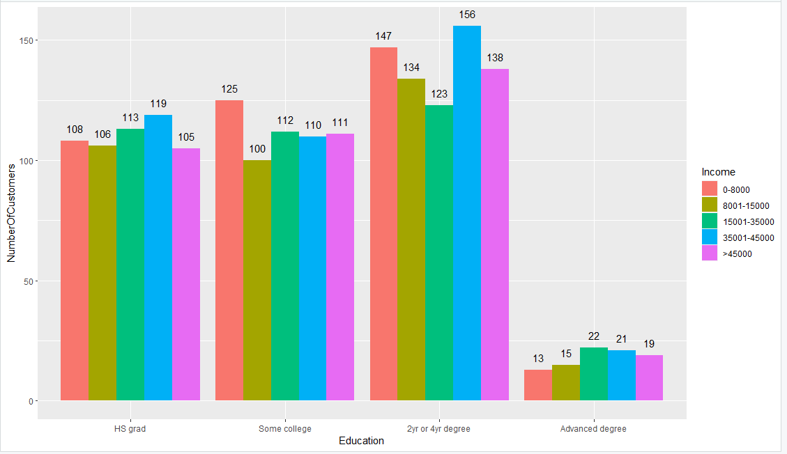
To add text to the chart, we will use the geom_text function from the ggplot2 package. This function is also connected to the other functions with a plus sign. The geom_text function has an argument aes, which has an argument label. We’ll set the label to NumberOfCustomers and it will take the values of the NumberOfCustomers variable and assign them as labels for the bars.
Another argument within the geom_text function is position which specifies where we want the labels to be positioned on the chart. We set the position equal to ‘position_dodge’ because the bars are set to ‘dodge’ and we want the text to line up with the position of the bars. We also specify width, which is the distance of the text from the bar. Then we specify the vertical position (vjust), which is the vertical distance of the text from the top of the bars.
EducationAndIncomeGroupedBarChart <- ggplot2::ggplot(data = aggregateByEducationAndIncome, aes(x = Education, y = NumberOfCustomers, fill = Income)) + ggplot2::geom_bar(position = “dodge”, stat = “identity”) + ggplot2::geom_text(aes(label = NumberOfCustomers), position = position_dodge(width = 0.9), vjust = -1) |
Output
Step 6.4: Change the labels on x and y axis
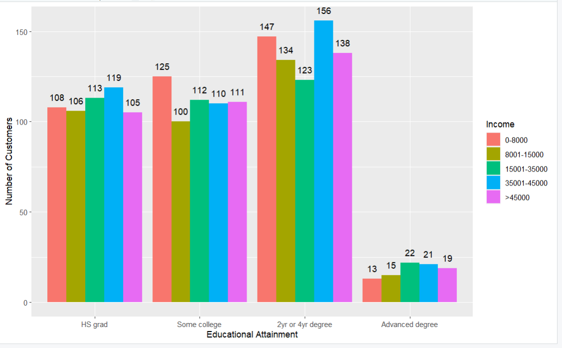
The next additions to the chart are the labels for the x-axis and y-axis. Although the default label is usually the name of the column or variable on the dataframe, we can customize it to something more insightful with the labs function from ggplot2. This function takes the argument for the x and y axes.
Here we changed x to ‘Educational Attainment’ and y to ‘Number of Customers’.
#create a bar plot of average credit score |
Output
Step 6.5: Change the colors of the bars
We can manually specify the colors we want for the different levels of income using the scale_fill_manual function from ggplot2. This function takes the argument ‘value’ and gives it a list of suitable colors. The number of colors provided must be the same as the number of levels of income because we used Income as our fill color.
#create a bar plot of average credit score
|
Output
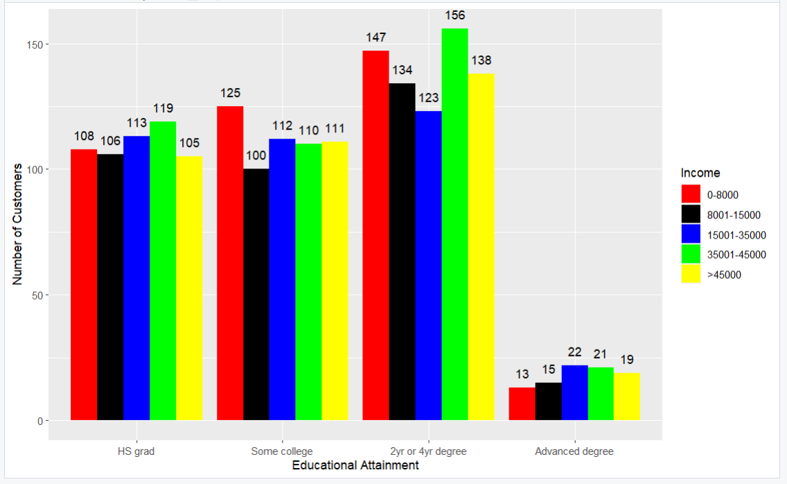
Here, we have a grouped bar chart with customized colors, labels and bars.
Call to Action
Are you a program evaluator or consultant that wants an easier way to leverage data analysis for your clients? Parsimony helps program evaluators and other consultants deliver clear and concise impact analysis, survey analysis, and descriptive analysis for their clients. Set up a call with Parsimony at https://parsimonyinc.com/contact/ to learn more.
Watch the video
Click here to follow along with a video showing how to create a grouped bar chart with R.