You roll up product usage for the semester, and it looks great. Daily streaks. Badges. Charts that climb. Your most engaged students are excelling, and the gains appear substantial. Teachers are sharing wins. Your dashboard is glowing. Procurement is hopeful.
Here’s the snag: those same students were already the ones who color-code their planners, ask for feedback, and show up to tutoring before exams. They’re your “power users” because they’re power students. Medical researchers have a name for this: the Healthy Adherer Effect. People who stick to a regimen, any regimen, tend to do better overall.
Not always because the regimen works, but because they bring motivation, support, and strong habits with them. In K–12, the effect can quietly turn “our program works” into “our most motivated students did well while using it.” That’s not the same claim. And it can lead districts, EdTech teams, and nonprofits to celebrate a win that isn’t actually theirs.
If you care about real change, you need quantitative evidence that separates engagement from impact. If you want real impact, don’t only study your best users. Study all users and use designs that separate engagement from effect.
What the Healthy Adherer Effect Means in Schools

In medicine, adherers don’t just take their pills. They exercise, eat better, follow instructions, and keep appointments. When you compare “took every dose” to “missed doses,” the first group often looks healthier even when the medication itself is inert. The difference is behavior and context.
School systems have a parallel. Highly engaged students often show up with stronger baseline scores, steadier attendance, more family support, and better self-regulation. They respond quickly to feedback. They finish homework on time. They also tend to explore extra resources and ask for help sooner. If you compare “heavy users” to “light or non-users,” you’re mixing the effect of the program with the effect of motivation and environment. That’s classic correlation ≠ causation.
This matters because it inflates apparent gains and narrows generalizability. Your pilot looks like a slam dunk, but the effect might shrink when you roll out across classrooms with different routines, less prep time, or fewer supports at home. The fix isn’t cynicism. It’s better design. Educational program impact evaluations exist to answer a simple question honestly: what changed because of the program, not just alongside it?
Where This Bias Hides in Plain Sight
You’ve seen these statements:
“Students who completed 80% of lessons gained 10 points.” Of course they did; they’re the ones who would grind anyway. Completion is a proxy for motivation, not proof of effect.
“Students who attended mentoring every week had better grades.” Sure, and they also tend to show up for everything else that helps them learn. Attendance signals commitment, which carries its own academic tailwinds.
“After we layered the intervention onto Ms. Ruiz’s class, scores popped.” Ms. Ruiz already runs a tight ship with feedback loops, clear routines, and family touchpoints. Anything you add there will look magical.
“Results from our opt-in pilot were outstanding.” Volunteers are often true believers with high trust and readiness. Their outcomes won’t mirror district-wide rollouts that include skeptics, newcomers, or campuses with staffing shortages.
If your proof starts with “our top users…,” you might be measuring grit, not your intervention. To understand impact, you need comparisons that hold engagement constant. That’s the aim of impact evaluations of educational interventions designed for real classrooms rather than ideal conditions.
Red Flags That You’re Overstating Impact
Watch out for these signals:
You only analyze students who met the usage target. That selects the go-getters and guarantees an optimistic picture.
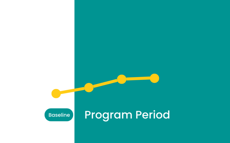
There’s no baseline, no prior test scores, prior attendance, or behavior history. Without starting points, your quantitative data can’t tell you what change the program added beyond existing trajectories.
Your comparison group is “anyone who didn’t use it,” with no matching on prior achievement or demographics. That’s apples to fruit salad.
Effects are huge for the most engaged and vanish for everyone else. That’s not causal confirmation.
All findings come from a vendor-authored PDF with no methods appendix. If you can’t see who was in, who was out, and how the model handled prior performance, assume the estimate leans friendly.
This is where impact evaluations of educational software and similar studies go off the rails when they rely on “power user vs. the rest” screenshots rather than careful comparisons. Dashboards are helpful for operations; they’re not proof of causality.
How to Get Closer to Causality
You don’t need a year-long randomized trial to be credible. You need habits that pull you toward fair comparisons and away from confounding. The following practices fit busy calendars and tight budgets.
Use an Assignment Lens, Not a Usage Lens.
Include all students assigned to the program in the treatment group, even if some barely use it. That’s intent-to-treat. It prevents your estimate from becoming a “most motivated” contest. If you learn midstream and adjust delivery, you’re already doing formative educational impact evaluations in the best sense: improving while measuring.
Account for Where Students Started.
Add baseline achievement and other observable factors like attendance, prior behavior incidents, English learner status, disability, and free/reduced lunch to your model. Control what you can see so you’re not crediting the program for advantages students already had. This is standard practice in educational program impact evaluations.
Build a Fair Comparison.
When randomization isn’t feasible, use matched comparisons. Propensity score matching, nearest neighbor matching, or teacher/class fixed effects can align groups on what matters.
Separate Dosage from Impact.
Check dose–response curves, but don’t call a higher dose “proof.” First, establish that the assignment itself created a change. Then use dosage to guide implementation supports, not to claim causality.
Pre-Register the Plan (Lightweight).
A simple, time-stamped analysis plan reduces the researcher’s freedom to cherry pick. It tells your board, funders, or customers: “We didn’t rummage through the data until something popped.”
Bring in Independence.
Skepticism fades when a neutral party runs the numbers. Independent educational program evaluations protect your credibility with superintendents, school boards, product buyers, and funders. And when decisions are close, the speed of rapid-cycle educational impact evaluations matters.
You don’t have semesters to spare. Also, remember that services, not just software, warrant the same scrutiny. Matched designs and intent-to-treat logic apply equally to tutoring, mentoring, counseling, and SEL programming. That’s why impact evaluations of educational services lean on the same playbook as high-quality studies of digital tools.
A Concrete Example with Numbers You Can Picture

A district pilots a math platform in Grades 6–8 across six middle schools. Leadership wants to know whether to renew and expand. The initial deck highlights usage: a quarter of students completed at least 80% of assigned modules.
Naïve Analysis (Usage-Only).
Compare the top 25% of users to everyone else. Result: the heavy-use group grows +0.18 SD more than non-users. Slides look great. Renewal feels easy. But the “non-users” include students who missed weeks of school, had spotty device access, or came in with much lower baselines.
Better Analysis (Intent-to-Treat with Baseline Controls).
Define treatment as “assigned the platform.” Include every assigned student (i.e., all students with a license), regardless of usage. Control for prior math scores, attendance, and other student characteristics. Now the estimate shifts: all assigned students show +0.10 SD overall, a modest but real signal. Subgroup analysis shows +0.12 SD for English learners, and near zero for students already in the top quartile.
Decision.
Renew, but do it surgically. Scale in grades and campuses where effects are positive. Pair implementation with time-protected practice. For K–5, where early checks showed flat results, explore a different tool or different supports. The lesson isn’t “no impact.” It’s “targeted impact.”
When you strip away the healthy adherer glow and bring quantitative evidence into focus, you still find wins, you just find the real ones, in the places they actually live.
Make It Practical with a MomentMN Snapshot Report
This is the gap the MomentMN Snapshot Report was built to close. Most teams don’t need a 100-page technical tome. They need a grounded estimate that stands up in a cabinet meeting and a board session, and they need it soon.
Why Snapshot Fits Real-World Constraints
Independent. Districts, EdTech teams, and nonprofits need answers that hold up under board questions and vendor scrutiny. Independence from Parsimony avoids spin and keeps stakeholder trust intact.
Fast. These are rapid-cycle educational impact evaluations: weeks, not semesters. You get results in time to inform renewals, grant deadlines, or budget meetings.
Low-burden. We work with the quantitative data that has already been collected such as assessment histories, attendance, behavior, and usage logs. No new tests. No survey fatigue.
Usable. Clear visuals, plain language, and a one-pager for leadership. For analysts, a concise methods appendix that explains comparison logic, baselines, and model choices without the fog.
What You Get in a Snapshot
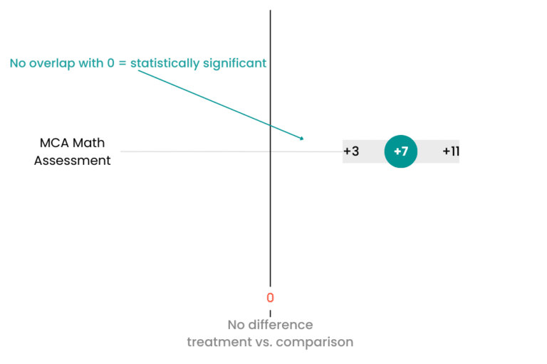
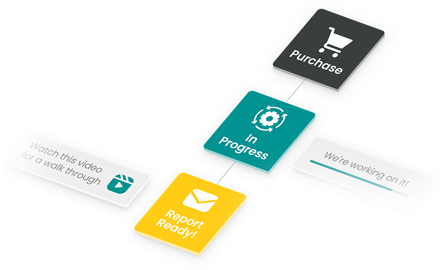
An intent-to-treat estimate that avoids the “power user” trap and reflects what the product or service actually accomplished. Subgroup insights that show who benefits most and where to adjust. Based on what’s provided in the report, you can create visuals you can copy and paste into your board presentation, marketing briefs, and more. With our provided video interpretation, you can communicate your data clearly to your stakeholders.
Audience-Specific Wins
Districts. Defensible impact evaluations of educational interventions to guide renewals, reallocations, and scale decisions. When someone asks, “How do we know it wasn’t just the motivated kids?” you have an answer.
EdTech marketing leaders. Third-party impact evaluations of educational software you can share with prospects and customer success teams. Stronger case studies without the side-eye.
Nonprofits. Credible impact evaluations of educational services for funders who need more than good stories. The findings also feed your improvement cycles, not just your grant reports.
If you want a program to thrive, clarity helps more than hype. The MomentMN Snapshot Report keeps the conversation honest and the timeline manageable, so your team can move from debate to decision while the window is still open.
Quick Self-Check: Are You in the Healthy Adherer Trap?
A 30-second quiz for you to use next time you suspect you may have run into this trap:
- Did we exclude assigned students who didn’t hit usage targets? If yes, your estimate probably leans rosy.
- Do our charts lack baseline comparisons? If yes, you can’t tell if gains reflect growth the students were already on track to achieve.
- Are all the biggest wins concentrated among already-strong performers? If yes, you may have a fit problem.
- Is our “evidence” mainly testimonials or a vendor slide deck? If yes, you have signals, not proof.
- Would a board member ask, “How do you know it wasn’t just the motivated students?” If yes, plan a re-run with intent-to-treat and matched comparisons.
If you hit yes on even two, your “impact” likely includes the healthy adherer effect. Time to rerun the numbers or let an independent partner do it fast.
See What a MomentMN Snapshot Report Can Do for You
Ready to separate enthusiasm from impact? Get a sample MomentMN Snapshot Report and see how an independent, formative educational impact evaluation turns your existing data into decisions you can defend.


